Design A Monthly Newsletter That Flips Like A Book
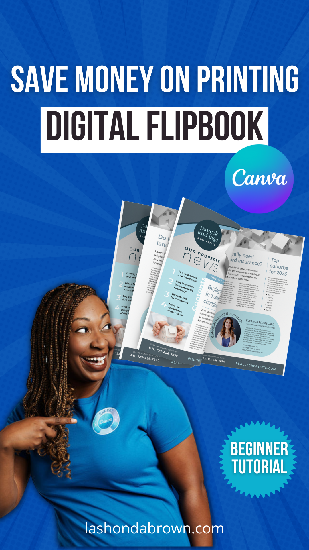
I have a lot of friends in the nonprofit world and now it's good time to start working on annual reports and newsletters. If you want to spice things up this year, read this tutorial. I'm going to show you how to design a newsletter that will flip like pages in a book when you send it digitally, so you can save money on printing paper copies. Without further ado, let's hop in.
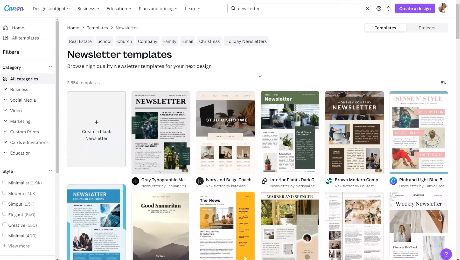
To turn your PDF into an interactive flipbook, we're going to utilize two different tools, we'll use Canva Pro to create your newsletter, and then we will send it over to Issuu to actually animate your pages. So to have a seamless process of creation, I would recommend going to Issuu creating your free account and then go ahead and stay logged in. So once you've finished designing your newsletter, all you'll need to do is to send it over to Issuu and you'll be able to see the finished design fairly easily. Now within Canva there are several ways that you can find templates, you can click on the left-hand side, you can select the category from underneath the search bar, or you can type in the search bar what you're looking for. In this case, we're going to type in the term newsletter.
And there's actually a fairly extensive collection of newsletter templates within Canva. And for most people, I would recommend starting with a template that's going to save you time from pulling in individual elements and you can actually combine templates to get the look that you're going for. So I would scroll through the 3500+ templates and select one that looks good to you for that front page. In the bottom right-hand corner, you're going to see if it's a Canva Pro design, and if you need Canva Pro, feel free to utilize my link lashondabrown.com/canva.
Now this particular design has more than one page so when you hover over it, it will show you the multiple pages within the design. So I'm going to go ahead and scroll through and find one that I think fits what I'm looking for. Once I've located that, I'll just give it a click and it will open up in the Design Editor. Now this particular template only has two pages. If you like the layouts that you see, but you need more, you can click on this icon to duplicate a page or you can pull in a layout from other templates if you want to see a variety of page styles.
Say for instance, if we liked what this appeared like, we could give that a click and we could replace page 3 with this layout. What I tend to do is map out all the pages of my document and then I go back through and make it fit my brand. I click on the elements and change the colors. I click on the text and change the fonts and adjust the sizes. Once you're done modifying your design, you want to do a couple of things. You definitely want to rename your design and this is a common problem I see. If you do not rename your design, your project will be the same name as the template which will make it very difficult for you to search for it later. So we'll go ahead and change the name of the design and we'll just use high school newspaper for this one.
To get access to a 30-Day FREE trial of Canva Pro visit https://lashondabrown.com/canva45
This is the longest free trial available for Canva and was provided to me as a Canva Verified Expert. Use this affiliate link to claim your 30-Day trial and support the channel at no additional cost to you.
And then we're going to locate the Share button in the top right-hand corner. Now remember I said it would be easier to go ahead and be logged into Issuu. So if you're not logged in, go ahead and do that. And then you'll click on Share, then More, and scroll. The integration we're looking for is Issuu. Once you click on that button, you're going to see Select pages. The default is for all the pages and your design to be present in your flipbook. So if for some reason there are pages that you designed for the sake of your PDF, but you don't actually want them in the flipbook, you can click on that drop-down and unselect the page on the right-hand side.
Once you have all the pages that you’d like, we're going to hit Save. From there, Canva is going to prepare your design and because it's integrated with Issuu, it's going to send that design to the Issuu site. Now you can obviously continue editing but if you want to take a look at your design click on View in Issuu. From there, it will open up in your Issuu account and it will show you your design as a draft. So to finalize everything, you'll need to click on the name of your design.
From there, you want to take a look to see if you like how it appears and when you're done, you need to publish. The publish button is located in the top right-hand corner. Confirm and publish to show that you have all the necessary rights to the content in your newsletter. And then you'll hit publish. You have a few options from there, you can view your publication live, or you can even embed this on your website. So we're going to hit view live and view it full screen. This is how your design will appear full screen and on the right-hand side you will see arrows to help you progress your design.
I think nonprofits can utilize this feature when they're sharing their annual reports to save on printing. You can use it within a civic organization like Rotary to share your monthly newsletters, or if you're a service provider, you can also use this as a way to onboard your clients and it'll give them a really cool customer experience to be able to thumb through your designs in a different way than just looking at it in a PDF viewer.
Thanks so much for reading this post. I'm LaShonda Brown, a Canva Verified Expert from Virginia. If you would like to try Canva Pro free for 30 days, visit lashondabrown.com/canva. I'm always available to help train your nonprofit team on how to get the most out of your Canva subscription. If you'd like to book a training, feel free to message me at lashondabrown.com Until next time to tata for now.

