DIY Your Logo and Animate It with Canva Pro
There is so much you can do with Canva and their upgraded automation tools. In this post, I'm going to show you how to create your own logo in Canva and animate it without ever having to use another program. Without further ado, let's hop in.
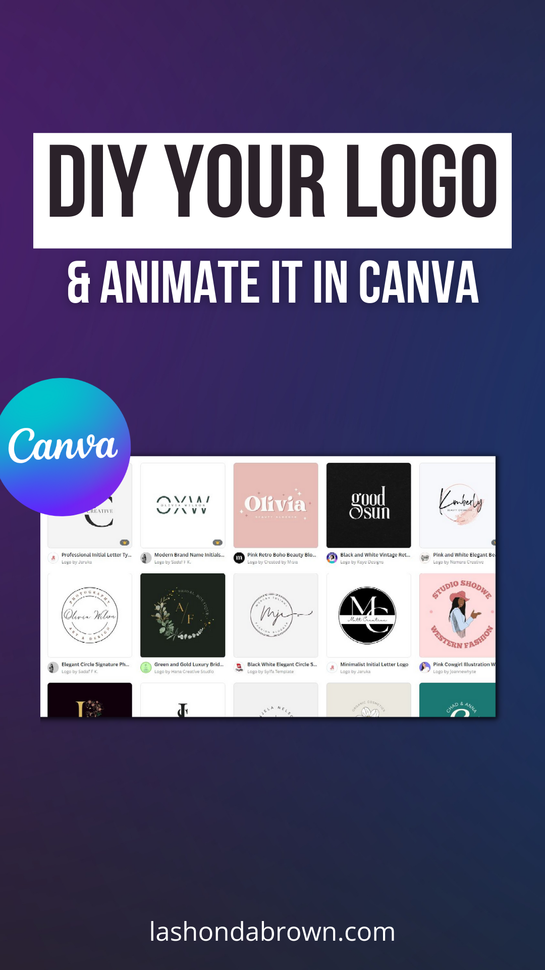
Creating a professional-looking logo is one of the best ways that you can catapult your business or your brand forward. If you were to search for logo templates within the Canva library, you would see that there are over 58,000 templates. So first and foremost, I would encourage you to search within the template library before you spend hours and hours digging on Pinterest. You can search by category at the top or you can simply scroll down. Now here's something to keep in mind. If you are trying to create a logo that you would want to trademark later on, you want to make sure that you utilize purely uploaded content, fonts, basic shapes, and lines only so that you can trademark it. So if that's one of the concerns that you have, I would encourage you to check out the licensing information here. Otherwise, if this is just for an event, or something personal, feel free to use one of the amazing templates to get started.
What I'm going to do in this example is I'm actually going to start with a blank logo however, I want to do three different variations and I'm going to explain why. So these are the logos for my husband's video production company who helps me produce the content for this channel. And as you can see, there are three different variations on Life Focus Pictures, and they all serve a different purpose. So if you are creating your logo from scratch, one thing I want to encourage you to do is to make sure that you have variations not just in style, but in color, so that when you come across a situation where you need to put your logo on it, you already have it designed and you don't have to worry about coming back into Canva to create it later. So I suggest creating a color, a black and a white version of all of your logos, and then three different arrangements of your font elements.
You want something that is in a single line like this logo down here. What's great about this logo is if I need to put it in the corner of a presentation or at the top of a letterhead. It doesn't take up much vertical space. So a single-line variation is super helpful to have, then you can have a stacked variation. I actually use this one the least but I will tell you if I am sponsoring an event, a stacked logo is a great way to get a little bit more visibility. Because look at these logos side by side. This one takes up way more space than this watermark-style logo. And what happens is your name catches people's attention when you are included in a sea of other logos so it's really helpful to have a stacked version as well. The last one you want to create is one that is in a circle or it is something that would fit into a square. And the purpose that would serve is a profile picture. Most social media platforms will crop your logo to be either a circle or a square and if I were to use something like this, the name would get cut off when it was cropped. Now what I'll do is show you the variety of templates that I use in order to make these three variations
The three templates that you'll want to search for when you're ready to start designing are the SoundCloud banner template for your single-line logo, a Facebook ad template for your stacked logo, and an Instagram post template for your circle or square logo. And the reason why I say search these templates is because the template space will be perfectly sized for these uses and you won't have to worry about cropping it later to fit those particular sizes. So I would open up a blank design under all of these categories, and then begin designing. So to do that, you would just click on the plus sign in the top left on all three. For this example we are going to utilize a fake brand and I'm going to show you how to make variations of your logo.
If you are looking for fonts that pair well together because you don't know the names of them off the top of your head, to save time, I encourage you to click on styles and then scroll down to font sets then click on see all. This will give you multiple font pairings some Sans Serif fonts, some Serif fonts, some Script fonts, from there you can select a set and put in your text for your brand or your business. So this is a great place to start if you are truly not a designer and you're not quite sure which fonts pair well together, Canva has made it incredibly easy utilizing font sets under styles.
Like I said before, you want to have multiple versions of your logo so in the top left-hand corner I actually named this black text and put the logo in black. Then if I make the background black you can see here that this is actually in white and so this would be a great logo to use on top of a photo. So you want to have a white text version then you also want to have a color version because there may be some cases where color will be helpful. And so for this example, I just used two browns from my brand kit. So when you have all of your variations then you want to rename your Canva design. I would put a dash stacked so it's easier to find in a list and then you can click on share and download. From there you want to select PNG and transparent background. You don't want to be in a position where you have to manually remove a white background from your logo, however as you can see by the crown on the right-hand side, this is a Canva Pro feature. So if you do not have Canva Pro and you would like access to it free for 30 days, feel free to use my link with lashondabrown.com/canva.
So this is our stacked version, this is our single-line logo and you can see that the text was rearranged to fit on a SoundCloud banner template to put everything in one line you have your black texture, your white, and your color. Finally, you have your circle or square logo and you can see by the circle that I pulled in, if I were to have no shame at all, this would crop well to a circle. Oftentimes in circle logo designs, I see curved text being used and you can actually achieve this look very easily in Canva by selecting your text, clicking on effects, and then locating curve underneath shape. If you pull on the sliders you can change the direction of the curve. So you would have one of your textboxes curving in one direction. And then you would make your other text curve in the opposite.
Now I also pulled in an icon that I had previously hired a graphic designer to create so if you are attempting to trademark your logo and you want to incorporate some type of icon or clip art I would recommend having someone design that for you so you own the rights to that little icon and that could be a great fit for you in the circle version of your logo.
To get access to a 30-Day FREE trial of Canva Pro visit lashondabrown.com/canva
This is the longest free trial available for Canva and was provided to me as a Canva Verified Expert. Use this affiliate link to claim your 30-Day trial and support the channel at no additional cost to you.
The last thing I want to show you is how to animate your logo within Canva. You can export this animation as a GIF that you could include as an image in an email, or you can also export it as an mp4 and use it when you are editing a video. So to animate your text, you have to make sure that you select it and you can also change how your text boxes are grouped. So say for instance, if you wanted Brown Skinned Girls Skin Care to be animated together but the date to be separate, you would simply group your text. So if you look in the top right-hand corner, you're going to see group or ungroup. Right now all these text boxes are separate, to group them, you would just hit the Shift key on your keyboard, select the first text box, and then select whatever you would want to group with it. Once you have them selected, click on Group in the top right.
From there, you can click on Animate, and you're going to see different effects that you can apply. You can do element effects or you can do page animations, which are combinations of animations. The last thing you can do is animate a single text box. To do that, simply select that text box, go up to animate and you'll see text animations appear. That option will not be available if you are selecting grouped text. So again, you want to have it singled out if you want specifically text animations. If that is in effect that you like just click on typewriter and then adjust the animation to fit your needs. You can animate it on entering, on exiting. or on both. You can change the speed by dragging the slider and you can also change the writing style. Either show it based on one character at a time or one word at a time.
Again, when you are done designing, all you need to do is click on share and click on download. If you are in a design with multiple variations of your logo, simply select one of them so that the animation doesn't stitch all of your pages together. To do that, just unclick at the top and select the page that you would like to animate and either save it as an mp4 or a GIF.
I hope this tutorial shows you how to create a really compelling logo within Canva and animate it to tell your brand story online. Remember you want to have multiple variations of your logo and multiple different colors. And when you save it be sure to check the box next to transparent background so you don't have to remove a white background when you're ready to use your designs.
Thanks so much for reading this post. I'm LaShonda Brown, a Canva Verified Expert from Virginia. If you would like a Canva Pro free trial for 30 days, visit lashondabrown.com/canva. And if you liked this post, you'll definitely want to watch my video about Canva presentations so you can add animations to your slide decks as well. Until next time to tata for now.


