Grow FAST on LINKEDIN with These CANVA DESIGNS
When it’s time for me to create content for LinkedIn, I am constantly going to Canva to create graphics and images to stand out on my feet. So in this tutorial, I'm going to show you a couple practical ways that you can leverage Canva to help increase your engagement on LinkedIn. Without further ado, let's hop in.
Right now I have 11.7k followers on Instagram with 70 posts and I'm following a little under 700 people. And although I do like Instagram for creating content in the moment, like when I'm at a conference, or I'm doing a breakout session, or even some sponsored content, it's not my go-to place to actually network and meet new people, mainly because Instagram is attracting people with lower budgets, and who aren't necessarily the decision makers that I want to be in touch with, because my primary customer is tech companies. I have noticed that a lot of people who work for SaaS companies are spending their time on LinkedIn and not on Instagram. So even though I have a following on Instagram, it's important for me to start growing my LinkedIn presence, so that that could be the primary place that I show up outside of YouTube.
So on Instagram, I'm always creating carousel posts and reels and say for instance, this particular post here, I created using b-roll that I shot during a conference that I was speaking at in Knoxville, TN. So I have those clips saved on my phone and after the event was over, I kicked my feet up in my hotel room, I created this little highlight reel and I tagged all the other speakers that were participating in it and I also tagged the conference and it got a couple 1000 views on Instagram, which right now with organic reach being down was a really good thing. So I'm still creating this type of content in the moment and it's performing well.
There is a video on my channel if you need help with creating vlog-style reels like this, and you can click on in the description. And I'm also creating carousel posts like this that are super meaty, they're like, basically blog posts, and these have also performed well.
However, I don't have a ton of time to design these meaty carousel posts, or spend all this time shooting content and editing content, like that blog-style reel. So instead of doing that, I am using compelling images on LinkedIn and I am creating really compelling captions to go with it and I have found that has performed well. I will go ahead and show you my LinkedIn. Right now, I’m at 1700 followers, which for me is really, really good because I started out the year not really utilizing this for business at all and so it's slowly starting to increase. I utilize Canva to create this cover art. And I think that's a great place for you to start.
A lot of people are leveraging the built in cover art on LinkedIn and that's really not helping you in your business. All of the cover art that I have designed for my brand and if I click on LinkedIn, then I already have cover art that's perfectly laid out for what my needs are. And so when I'm doing 25 days of Canva I'm just leveraging this cover art that I already created. And that way I don't have to create new graphics every single year. And you can see that there have been some variations. I really love what Lakrisha does and so, I save this as inspiration for my graphics and I made it my own. And what I have found is that if you center yourself and your text when it's on a cell phone, this side area on the left and the right gets cut off and your profile picture shows up in that bottom left region and so it perfectly sizes up.
For me, what I wanted to say on my LinkedIn is I reduced tech overwhelm for business owners on a budget and craft content for SaaS brands that serve them. This is not a duplicate of what is in my header on my LinkedIn profile. I have played around with a bunch of different variations of this and I have found that because this is searchable, I want my title if you will, to look more professional and so I want to put that name of the brand, I put my current following is 27k on YouTube, #CanvaVerifiedExpert and #FlodeskUniversityInstructor and so that way from a glance, you can see that I have partnered with brands.
To get access to a 30-Day FREE trial of Canva Pro visit lashondabrown.com/canva
This is the longest free trial available for Canva and was provided to me as a Canva Verified Expert. Use this affiliate link to claim your 30-Day trial and support the channel at no additional cost to you.
For me, what I wanted to say on my LinkedIn is I reduced tech overwhelm for business owners on a budget and craft content for SaaS brands that serve them. This is not a duplicate of what is in my header on my LinkedIn profile. I have played around with a bunch of different variations of this and I have found that because this is searchable, I want my title if you will, to look more professional and so I want to put that name of the brand, I put my current following is 27k on YouTube, #CanvaVerifiedExpert and #FlodeskUniversityIinstructor and so that way from a glance, you can see that I have partnered with brands.
Now I love this photo that Amanda took of Josh and I for the holidays. But it was dead outside and by the time we actually took this image. It's giving a lot of parking lot and everything is dead behind us. And so what I wanted to do was to leverage magic edit to make it more compelling because I have seen that when photos are more vibrant and they really stand out, then they tend to get a boost in engagement with very little effort. So there's a couple of ways that you can go about this you could say I want to remove the background. And in this case, it completely got rid of the Christmas tree. Then I could go to elements and I can throw in something fun like that. And so that's what gave you you know, a nice look and feel. But my problem with doing something like this and a LinkedIn post is it looks canned, right? So many of us have seen Canva graphics over and over and over on platforms like Twitter and LinkedIn.
And so this is not going to perform as well as an actual photo background because it's more authentic. So if I were to go back, and I'm going to click on Magic Edit, from there, I'm going to zoom in and I'm going to make the brush size as big as possible to save myself a lot of time. And it doesn't have to be perfect but you need to show the AI what you're trying to replace. We're going to click continue and we're going to say Christmas downtown skyline. Super simple. Now, I'm not gonna lie to you, sometimes, you're gonna get random people and not really sure why. But we have other options so don't be deterred. If you see random folks pop into the background. Just keep it moving and maybe laugh a little about it. Right now it's giving just the sides and it's still looking pretty dead. So you know my options are maybe this one or that one. And you can see how much more vibrant image becomes with that artificial back.
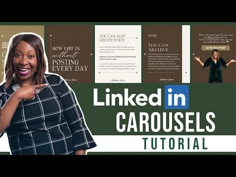
And so I have found on LinkedIn when you do more visually compelling posts, you tend to get people to click on your content. And then if your caption is meaty then people tend to engage, so that is one example of what you can do leveraging Magic Edit. The other thing that I would say I see people doing a lot and if you guys are stopped doing it, because there's a better way. A lot of you are creating carousel posts that you post on Instagram and try to repurpose on LinkedIn and that's great, but you're posting them incorrectly. In order to get that carousel feel on LinkedIn, what you have to do is click on Share, Download, not PNG, my friends, you need to download it as a PDF. The reason why you want to do that and I will show you the difference is Linkedin a showing your carousel as a PDF preview. So this was posted to Instagram. You can see here it says six pages. So in order to get that carousel feel, you have to upload it as a PDF. And so what LinkedIn is doing, is it's showing you a preview of the PDF. And if you do that you get the carousel look and it takes up more space on your feed instead of having a gallery view of what you're posting. Whether you are editing your photos and Canva to make them more compelling, you're replacing background or you're repurposing content and you're uploading it as a PDF, these are some very simple strategies that you can implement that will help increase your LinkedIn engagement.
I hope you guys enjoyed this post. Of course, I want you to follow me on LinkedIn. And if you liked this video, be sure to give it a thumbs up. And don't forget I have the link for a free 30-day trial of Canva Pro if you go to lashondabrown.com/canva. Until next time, ciao for now.


